Anyone familiar with Looker knows that it is an extremely robust tool with many features that can go unnoticed. Power users seek out these features and build them into their Looks and dashboards in clever ways. Here are a collection of tips and tricks I’ve found and observed that helped my visualizations look more buttoned up, expedited my time to code, and helped me navigate through Looker faster.
(Note: The Windows equivalent to the shortcuts are placed in parentheses.)
Related: Improve Looker speed and performance with a Looker Health Check
Tips for Better Visualizations
When it comes to visualizations, being able to adjust the formatting of the values displayed on the measures/the axis and choose which measures will have values displayed in the visualization can help elevate dashboards to the next level.
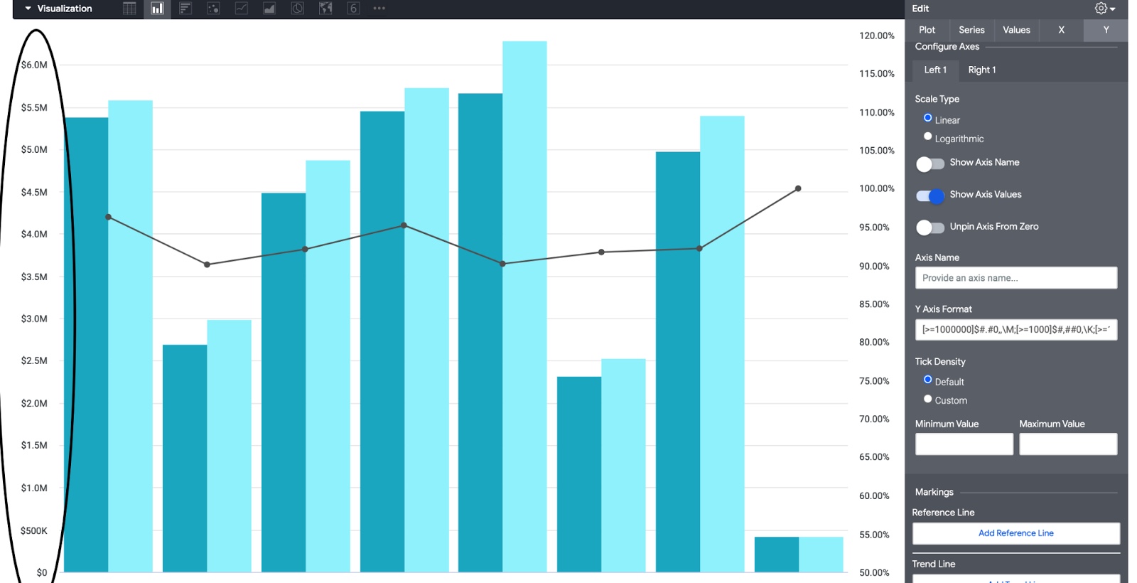
As seen above, you can use value formats to create streamlined visualizations where the axis do not create excessive white space. To do so, navigate to the edit menu and under y, use value formats to make your axis easier to read. We can also use the same value format code to create abbreviated value labels.
In the code, we use M for numbers greater than a million, K for numbers greater than one thousand and no abbreviation for numbers less than one thousand).
For positive numbers: [>=1000000]$#.#0,,\M;[>=1000]$#,##0,\K;[>=1]$##0
For negative numbers: [<=-1000000]-$#.#0,,\M;[<=-1000]-$#,##0,\K;[<=-1]-$##0
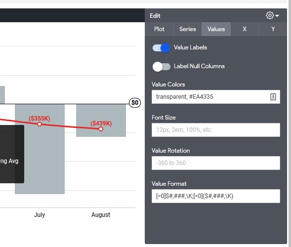
As shown above, for visualizations, under values, you can hide values on certain columns by using “transparent” under value colors. Note: Make sure to use the same order as the legend to ensure you are hiding your intended column’s values from the visualization.
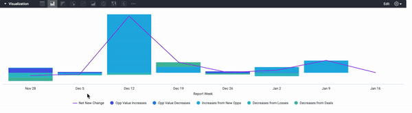
As shown above, use option + click (alt + click) to show a singular bar within a bar chart with multiple bars; use option + click (alt + click) again to reveal all the bars again.
LookML Secrets
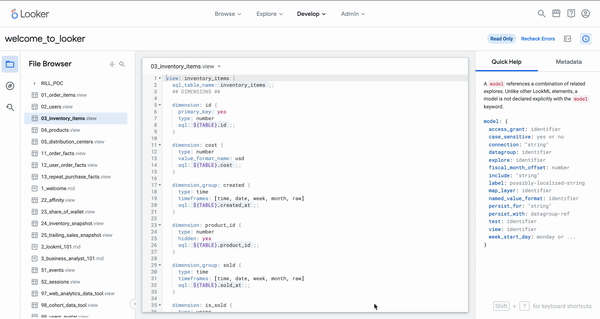
Both quickly browsing through LookML to find views and editing big chunks of code can be accomplished with the help of a few keyboard shortcuts.
As seen above, you can save time by finding views or objects in Looker with cmd + j (ctrl + j).
As seen above, Cmd + click/drag (Ctrl + click/drag) on different objects for multiple cursors. It can also be used to copy segments of code in different locations throughout the view file.
Efficient SQL Runner
Looker’s SQL runner provides developers with a fast way to query data and create derived tables using the data warehouse. In addition, you can use sql runner to quickly make mass adjustments to your code by using the find and replace function.
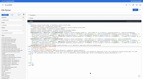
As seen above, you can avoid doing the same style of formatting by pasting and editing one’s lookml with sql runner and cmd + F (ctrl+F). Use Looker’s inbuilt find and replace function to quickly add or edit code.
Dashboard Buttons
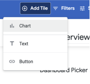
The content section is broken down into four parts. First, you have the label of your button. Next, you have the link that the button will navigate to. After that, you can have a description appear on hover and finally you have the option to open the link in a new tab or not.
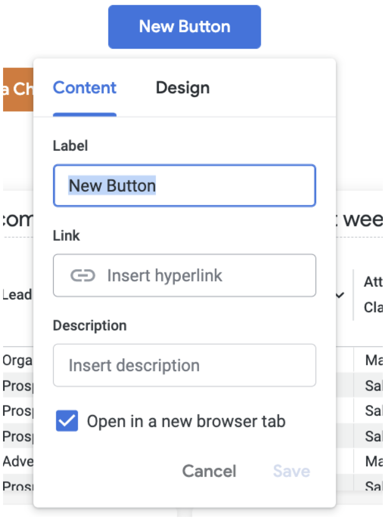
NOTE: You cannot use liquid references within the hyperlink (can only use markdown syntax). Unfortunately, there is no current way to use the button tile to inherit filters across dashboards
Example of valid link: https://<company_name>.cloud.looker.com/dashboards/70?Change%20Date%20Range=30%20day&Close%20Date%20Range=this%20quarter&Account%20Owner=&Region=&Sales%20Territory=&Attribution%20Classification=
Example of invalid link:
https://<company_name>.cloud.looker.com/dashboards/69?Account+Owner={{_filters[‘salesforce__account.owner_name’]|url_encode}}&Region={{_filters[‘salesforce__account.region’]|url_encode}}&Sales+Territory={{_filters[‘salesforce__opportunity.sales_territory’]|url_encode}}&Classification={{_filters[‘salesforce__opportunity.attribution_classification’]|url_encode}}
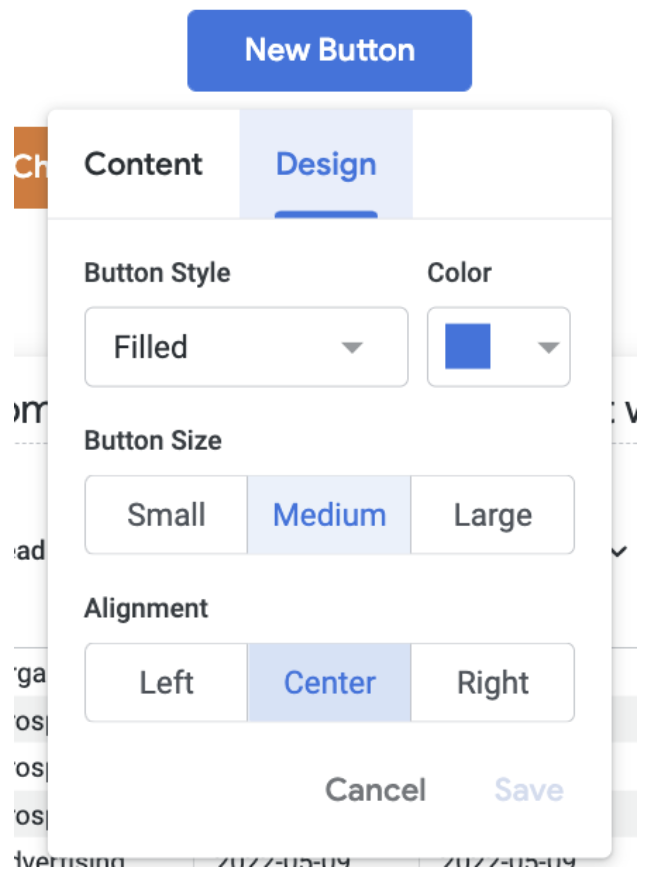
In the design tab, you can choose the style, color, size and alignment of the button. I recommend using color to differentiate between dashboards that belong to different departments or using color to differentiate between the functions of each dashboard (monitoring vs analytics).
Putting It Together
With these marginal improvements, you can have a much more enjoyable experience creating streamlined visualizations and coding in Looker. With these tips and tricks, you will be able to spend more time problem solving and tackling the reporting needs of the business.
As Looker experts, Data Clymer is here to help! Don’t hesitate to contact us if you have questions about improving Looker dashboard performance, implementing Looker, choosing between Sigma vs Looker, or using the platform to improve your data and analytics strategy. We also have a Looker Health Check to help organizations improve Looker speed and performance, uncover errors, and implement best practices.
Naveed Lakhani
Naveed is data engineer and analyst with a sharp eye on business outcomes. Combined with excellent communication, he will drive any organization to become more data driven.